Spatial Design ll / Task 1
Starting from 12.2024
4.2025 -8.2025 / Week 1 - Week 14
Ge Xianjing / 0377636
Spatial Design ll / Bachelor of Interactive Spatial Design (Honours)
Week1
Personal Reflection (Expanded Version)
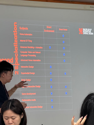
After today’s class, I gained a deeper understanding of my own learning path.
At first, I thought choosing Smart Home Design would be a more practical option, since this field is rapidly growing in China and seems to offer better job prospects. However, one thing the instructor emphasized truly resonated with me:
"Those who go far are the ones who combine passion with professionalism."
Reflecting on my past learning experiences, I realized that whenever I was genuinely passionate about something, I learned faster and felt more fulfilled. In contrast, when I pursued something just for its practicality, it was hard to stay motivated — especially when challenges arose.
Even though my programming skills are still developing, I am deeply passionate about designing spaces that tell stories and create emotional connections. Compared to cold automation, I want to craft environments that touch people, that create memorable experiences.
This realization strengthened my decision to choose Smart Environment Design.
I know this path won’t be easy.
It requires me to continuously refine my artistic expression and also master new technologies, such as sensor applications and interactive programming. But it is precisely because of these challenges that the journey feels meaningful.
In the future, I hope to design spaces that make people pause, smile, or even feel moved.
Maybe my starting point isn't the highest, but I believe that if I stay driven by passion, keep learning, and push through obstacles, one day my designs will become a beautiful part of people's lives.
This time, I am not choosing based on “better job opportunities.”
I am choosing based on the path I truly want to walk.
Personal Reflection (Expanded Version)
After today’s class, I gained a deeper understanding of my own learning path.
At first, I thought choosing Smart Home Design would be a more practical option, since this field is rapidly growing in China and seems to offer better job prospects. However, one thing the instructor emphasized truly resonated with me:
"Those who go far are the ones who combine passion with professionalism."
Reflecting on my past learning experiences, I realized that whenever I was genuinely passionate about something, I learned faster and felt more fulfilled. In contrast, when I pursued something just for its practicality, it was hard to stay motivated — especially when challenges arose.
Even though my programming skills are still developing, I am deeply passionate about designing spaces that tell stories and create emotional connections. Compared to cold automation, I want to craft environments that touch people, that create memorable experiences.
This realization strengthened my decision to choose Smart Environment Design.
Course Summary
Week 2
In today's class, the teacher first explained a courseware on design research. 📖 The content of the courseware focused on the research methods and key points of design projects. It emphasized the importance of studying precedents in enhancing our understanding of design. We were taught to analyze from multiple aspects such as space, materials, user experience, and design thinking. Instead of simply copying, we need to interpret critically to gain new design inspiration. 🌟
After that, the teacher introduced the assignment for the next two weeks. This assignment requires us to research two stores. One is an overseas store, for which we can obtain information through online research. The other is a physical store in Kuala Lumpur, where we need to conduct on - site inspections and take photos. 📸
When choosing the stores, we should ensure that there is sufficient information for analysis. It is advisable to select stores of the same type but with different brands, such as restaurants or clothing stores. The assignment includes analyzing various aspects of the store design, such as design features, material usage, lighting design, color schemes, the impact of layout on customer behavior, technological innovation, and sustainable design practices. At the same time, we need to identify areas for improvement in the stores and draw sketches. The assignment report should be at least 15 pages long, including photos, sketches, etc., and we need to cite at least three reference resources and mark them correctly. 📚
To make us more aware of the assignment requirements, the teacher showed excellent assignment examples from senior students. 📋 The assignments of senior students started with an overview of the store and then analyzed in detail the store's layout, functional zoning, material usage, technological applications, sustainable measures, and other aspects.
They also proposed improvement plans for the existing problems in the stores, such as enhancing the customer experience by changing the spatial layout and optimizing material usage. This gave me a more intuitive understanding of how to complete the assignment and I learned a lot of analysis and design ideas. 💡
🌈After returning home, I looked up information, trying to find some retail stores with unique features. For example, a store that uses a lot of interactive installations, or one that has a smooth layout, making it convenient for customers to browse the entire store. Fortunately, I came across a post about Gentle Monster's pop - up concept.
Moreover, I found on Xiaohongshu that they have already opened a physical store in Malaysia. So I can tentatively choose it as the store for my offline exploration.
However, after consulting with the Mr.Zeon . I learned that he thought there weren't many interactive installations in this store that were worthy of analysis, and he hoped I could choose another one. So, after some thought, I decided to go with the Gentle Monster sunglasses brand instead. Their store in London is truly outstanding. It has two floors, with an entire floor dedicated to showcasing interactive installations. They feature really avant - garde concepts like "Alien Invasion", which is really fascinating.
I’ll switch the overseas case back to Gentle Monster London Flagship and structure the content around the 10 evaluation points from the tutorial handout:
-
Store Overview
-
Design Feature – Layout
-
Design Feature – Materials
-
Design Feature – Lighting
-
Design Feature – Colour Scheme
-
Brand Identity
-
Customer Experience
-
Technology Integration
-
Sustainability
-
Challenges & Opportunities (plus improvement sketches)
I’ll expand each section with London-specific details, add critical insights, and format everything so you can drop it straight into your e-portfolio slides or web page.
(Case Analysis: Take IKEA and others as examples to analyze the impact of different spatial designs on user behavior. Some spaces increase product exposure and sales by controlling the path, while setting up unobvious shortcuts; while some other spaces give users more freedom, enhancing the user experience.)
Gentle Monster London Flagship
- Store Overview

Opened in 2018 at 28–29 Argyll Street, Soho. Roughly 465 m². First U.K. outpost of the Korean eyewear label known for turning retail into art exhibitions.
- Layout
- Materials
- Lighting
- Colour Scheme
- Brand Identity
- Customer Experience
- Technology Integration
- Sustainability
- Challenges & Opportunities
-
Linear flow can confuse newcomers and cause skipped SKUs.
Moving art demands high maintenance.
Fixes: subtle floor arrows or wall beacons to clarify the loop; QR plaques by each display for instant product details; colour-coded plinth bases to separate collections and aid navigation.


Comments
Post a Comment