Application Design II /Task 1: App Design 1
Self-Evaluation and Reflection
Starting from 12.2024
4.2025 -8.2025 / Week 1 - Week 14
Ge Xianjing / 0377636
Application Design 2 / Interactive Space Design


To-Do List:
-
Write a reflection on the redesign work of the Baidu App
-
Identify elements to change and update
Final Report: Baidu High-Fidelity Prototype Modifications
Name: Ge Xianjing
Major: Interactive Space Design
Project Title: Baidu Interface Redesign and High-Fidelity Prototype
Major: Interactive Space Design
Project Title: Baidu Interface Redesign and High-Fidelity Prototype
Background and Premise
In the previous semester, my design project focused on improving Baidu’s user experience by redesigning key functional interfaces, such as hotel booking, personal information editing, and route planning in Baidu Maps. Based on early low-fidelity prototypes, user testing, and teacher feedback, I created a high-fidelity prototype using Figma, and implemented a series of visual and interaction enhancements.

Key Modifications and Improvements
1) Icon Design Optimization
-
What was modified: Added explanatory text labels under each icon and adjusted icon size and alignment.
-
Result: Improved recognizability and clarity of functions, especially in the Maps and Personal Center interfaces.
-
Based on teacher feedback: “Icons should not just be decorative; they must clearly represent functionality.”
What was modified: Added explanatory text labels under each icon and adjusted icon size and alignment.
Result: Improved recognizability and clarity of functions, especially in the Maps and Personal Center interfaces.
Based on teacher feedback: “Icons should not just be decorative; they must clearly represent functionality.”
2) Layout and Information Structure
-
What was modified: Reorganized the information hierarchy by grouping content into visual modules with proper spacing.
-
Result: Reduced cognitive load, made content easier to digest, and improved reading flow.
-
Example: On the hotel detail page, hotel photos, pricing, and reviews were separated into distinct sections.
What was modified: Reorganized the information hierarchy by grouping content into visual modules with proper spacing.
Result: Reduced cognitive load, made content easier to digest, and improved reading flow.
Example: On the hotel detail page, hotel photos, pricing, and reviews were separated into distinct sections.
3) Animation and Page Transitions
-
What was modified: Added micro-interactions and animations when switching between pages or tapping functions.
-
Result: Made the interaction smoother and more realistic, resembling actual app behavior.
-
Example: Route animation in Baidu Maps, success pop-up after name change in Personal Center.
What was modified: Added micro-interactions and animations when switching between pages or tapping functions.
Result: Made the interaction smoother and more realistic, resembling actual app behavior.
Example: Route animation in Baidu Maps, success pop-up after name change in Personal Center.
4) Functional Flow Optimization
-
Optimized user flows for:
-
Hotel booking using Baidu Search
-
Viewing short videos on Baidu
-
Editing the user’s name in Personal Center
-
Route searching using Baidu Maps
-
Result: Clearer logic, more intuitive operations, and fewer unnecessary steps.
-
Key focus: Added input guidance, step-by-step interaction, and visual prompts.
Optimized user flows for:
-
Hotel booking using Baidu Search
-
Viewing short videos on Baidu
-
Editing the user’s name in Personal Center
-
Route searching using Baidu Maps
Result: Clearer logic, more intuitive operations, and fewer unnecessary steps.
Key focus: Added input guidance, step-by-step interaction, and visual prompts.
5) Input Fields and Smart Suggestions
-
What was modified: Added placeholder texts, dynamic keyword suggestions, and validation messages in input fields.
-
Result: Reduced errors and improved user input efficiency.
-
Example: Typing "Bodrum" in the search bar triggers dynamic keyword suggestions.
What was modified: Added placeholder texts, dynamic keyword suggestions, and validation messages in input fields.
Result: Reduced errors and improved user input efficiency.
Example: Typing "Bodrum" in the search bar triggers dynamic keyword suggestions.
6) Visual Style and Color Consistency
-
What was modified: Unified the overall color scheme (blue and light gray), standardized font sizes and button styles.
-
Result: Achieved visual consistency and a more professional appearance.
-
Based on teacher feedback: “Color and style should reflect Baidu’s brand identity.”
What was modified: Unified the overall color scheme (blue and light gray), standardized font sizes and button styles.
Result: Achieved visual consistency and a more professional appearance.
Based on teacher feedback: “Color and style should reflect Baidu’s brand identity.”
7) High-Fidelity Prototype Interactions
-
What was modified: Added full-page linking, state changes for clicks, loading indicators, and animated map lines.
-
Result: Created a more immersive and testable user experience within the prototype.
What was modified: Added full-page linking, state changes for clicks, loading indicators, and animated map lines.
Result: Created a more immersive and testable user experience within the prototype.
User Experience Improvements After Modifications
Item
Original Problem
After Modification
Unclear icon meanings
Users confused by abstract icons
Added labels for clarity
Dense page layout
Visual overload
Clear modular sections
Lack of interaction feedback
Stiff and static transitions
Added animation and micro-interactions
Complicated user flow
Users lost in steps
Simplified and guided actions
Reflection:
Last semester, I redesigned an application and named it "Baidu App Redesign." Over the course of 14 weeks, I was overall quite satisfied with the final outcome. However, upon further review, I realized there are still improvements that could be made, particularly regarding UI/UX details, functional logic optimization, and visual consistency.
To approach these enhancements more systematically, I evaluated the design by focusing on usability, visual appeal, intuitiveness, and the overall user experience.


Comprehensive UX Review Based on Your Latest Baidu‑app Mock‑ups
(search home, news feed, hotel booking, etc.)
AI suggestions
Strengths
-
Well‑reworked color system
You boldly replaced the original blue‑and‑white scheme with a purple‑and‑white palette and even added a warm gradient background (soft purple fading into light yellow on the splash screen). The result feels gentle, rational and friendly—an eye‑catching direction seldom seen in search apps. -
Clear typography hierarchy
Headings, body text and button labels now follow fixed sizes and weights (e.g., 24 pt bold for titles, 20 pt for body, 14 pt for hints). This ends the former font chaos and makes reading smoother. -
More prominent buttons
Enlarged button text (e.g., on the hotel‑booking page) plus deep‑purple / pink backgrounds give stronger click cues and action clarity. -
Soft, fresh calendar & feed modules
The new palette makes the calendar look lighter and more welcoming, breaking the cold, tool‑like feel and adding visual pleasure.
Areas for Improvement
-
Stronger visual hierarchy through spacing
On some screens the gaps between titles, content blocks and buttons are still tight. Increase vertical spacing to about 24–32 px per module to sharpen section boundaries and create a steadier rhythm. -
Contrast & accessibility
Soft purple on pale lavender or pink can lack contrast. Make sure:-
Primary buttons keep a text‑to‑background contrast ratio above 4.5:1.
-
Regular text does not appear in light purple / grey on light backgrounds—this helps low‑vision users.
-
-
System‑safe font fallback
Using “Inter” throughout is fine, but confirm it renders on all platforms, especially Android. Provide a system fallback or default OS font to ensure accessibility. -
Splash‑screen polish
The loading screen looks clean but slightly empty. Consider adding:-
A simple brand logo or icon.
-
One short tagline—e.g., “Loading your smarter search…”—to boost brand presence and ease the wait.
-
Summary
Your redesign excels in visual appeal, consistency and brand distinctiveness, especially through unified color language and typography. To push it further, refine spacing, color contrast and feedback for an even better user flow and stronger accessibility.
General Design Changes:
Color System Redesign: From Blue-White to Purple-White
In the original version, Baidu’s dominant blue-white color scheme felt rigid and limiting, which influenced the direction of my previous redesign. For this revision, I decided to completely overhaul the color palette and adopt a purple-white scheme instead.
Purple, especially in its softer tones, evokes a sense of rationality, trustworthiness, and gentle power. It maintains the sense of professionalism while introducing a more calming and friendly visual atmosphere. Compared to the cool, distant feel of blue, soft purple offers a warmer emotional connection, which better aligns with a user-centric and modern interface.

 (Original registration page)


- The original button labels appeared slightly too small, making them less noticeable and harder to interact with. In this redesign, I increased the font size of the button text to enhance clarity and ensure that call-to-action elements are more prominent and accessible at a glance.


- For the main page of search software, I still believe that simplicity should be the main focus, so I only changed the background color to make it more relevant to the theme
- Replaced the AI's words with the title in the chat 💬 sign


- Replaced with new color schemes, making the cold software seem lively


- In the original search page, inconsistent font usage created a fragmented visual experience. To address this, I replaced all text elements with the “Inter” typeface. This change not only unifies the overall typography but also enhances readability and modernizes the interface.


- Modifying the page displaying search results is relatively simple, just changing the color scheme is enough


 (new)
(new)
Button & Date Picker Redesign
The original hotel booking button is now purple for stronger visual focus. The date selection uses soft pink to highlight interactivity, creating a warm and inviting look that fits the new purple-white theme.
 ( new)
For the successfully booked page, modifications were made, such as enlarging the font of 'thank you for Booking' and centering the prompt sentenceThe user profile interface has replaced the color (Original user information modification page)
 (NewNew user information modification page)
Calendar Color Update
I’m very satisfied with the new calendar colors—they feel fresh and clean. Compared to most mainstream search platforms, the use of purple creates a unique and refreshing aesthetic, offering a new visual path rarely explored in this category.


 (Original calendar)
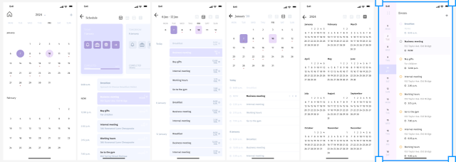 (New calendar)

 (New calendar)
 (Original private message page)
 (New private message page)
There hasn't been much change to the map navigation page, only the icon color has been changed

The short video channel page can actually be scrolled, but due to canvas settings, panoramic views cannot be displayed here


 (Final personal page)
Final design of page for viewing collection history


Final design presentation

Demo video (During the demonstration, I actually discovered some interaction issues again, so I made the third modification to ensure smooth use)software prototype
https://www.figma.com/proto/aHDWOO7Xz1tyNXKTMk4BUC/Untitled?node-id=0-1&t=H9SSCKCQKlRiY4fM-1


Interface Changes:
Information Architecture Optimization
One key question I asked myself during the redesign was:
How can I make it easier for users to understand and navigate the app?
My solutions included:
-
Clear and Intuitive Navigation:
A bottom tab bar was implemented for primary sections (Search, Content, Tools, My Account), while secondary functions。 Simplified Onboarding Process:
New users are guided through a concise introduction to the app’s main features, using visual cues, tooltips, or an interactive tutorial to ensure a friendly and smooth first experience.
-
Consistency and Familiarity:
UI patterns, button styles, font sizes, and spacing ratios were standardized to create a coherent look and feel across different interfaces, helping users quickly understand and interact with the app. -
Visualized Search Results:
Some search results were redesigned into card or chart layouts, allowing users to scan and absorb information faster. -
Clear Differentiation for Ads and Paid Content:
Advertisements and sponsored content are distinctly labeled to enhance transparency and build user trust.
Enhanced Search Experience:
-
Implemented Smart Keyword Suggestions, providing real-time prompts as users type.
-
Introduced an AI Summary Section at the top of search results, extracting key information to reduce user browsing effort.
🔍 Reflection & Redesign Summary (Case Study: Meal Planner App)
Throughout this redesign project, I focused on improving four key aspects of the interface: typography consistency, color system clarity, information hierarchy, and functional simplification. Additionally, I critically examined existing platforms such as Baidu, identifying common UI/UX issues and proposing practical redesign suggestions.
1. Unified Typography: Eliminating Visual Inconsistency
The original interface used multiple fonts, leading to a fragmented visual identity and poor readability. To solve this, I standardized the entire application using the Source Han Sans font, with clear rules for text types: titles set at 24pt bold, body text at 14pt regular, and buttons at 16pt bold. This approach improved readability, established visual hierarchy, and reinforced the app’s brand consistency.
2. Color System Optimization: Enhancing Recognition and Visual Flow
3. Comparative Critique: Baidu Homepage and Feature Overload
💡 Issue 1: Baidu’s homepage feels overly minimal and under-informative
The current homepage focuses almost exclusively on the search bar, lacking interactive content, guidance, or personalized recommendations.
✅ Suggested Redesign:
Introduce modular card layouts: Daily trends, tools, and personalized links
Add icon-based quick access (e.g., email, calendar, translation, dictionary)
Support theme switching and homepage customization to improve user retention
💡 Issue 2: Baidu App suffers from feature bloat
The mobile app includes too many unrelated features like word memorization, games, or live streams, cluttering the experience for core users.
✅ Suggested Redesign:
Remove low-priority functions like “word learning” or games from the main screen
Refocus the homepage on search and curated content feed
Emphasize practical tools like search history, trending topics, and voice/image search, ensuring the experience is fast and user-driven
🎯 Final Thoughts:
This redesign not only improved the visual and functional quality of the Meal Planner app, but also strengthened my understanding of modern UI/UX standards. By comparing with large-scale platforms such as Baidu, I gained valuable insights into balancing minimalism with functionality, and the importance of clarity, consistency, and user-centered design. In future iterations, I will continue to test prototypes, gather feedback, and strive for deeper user engagement.
Continuous user testing and feedback collection will also be essential to iteratively optimize both the interface and the functionality, ensuring the Baidu App remains efficient, modern, and user-centered.
Conclusion:
Overall, this Baidu App redesign experience made me realize that good UI/UX design is not only about making things visually appealing, but also about making every detail serve a better user experience.
In future iterations, I aim to continue refining usability, visual consistency, and functional logic to ensure that my designs remain truly user-centered—balancing practicality and aesthetics in a meaningful way.
Week 2
In this class, the teacher assigned the task of redesigning boarding passes. After receiving the task, my group members and I started a discussion on how to present the information more effectively. Everyone shared their ideas, starting from the needs of the target audience and repeatedly deliberating on the layout and presentation of each information section. Finally, we completed the design.


During the presentation session, each group shared its unique design ideas. Some groups classified and organized the information according to the needs of different audiences, such as passengers and airport staff, making the key information clear at a glance. Other groups skillfully used colors and graphics to enhance the visual effect of the boarding passes, making the important information more prominent. I learned a lot of novel ideas from the presentations of other groups and also discovered areas for improvement in my group's design.


After the presentations, the teacher commented on the designs of each group. The teacher affirmed everyone's efforts and creativity and also gave many practical suggestions. The teacher emphasized that information architecture should not only focus on aesthetics but also objectively analyze the importance of information and organize and present it according to the needs of different audiences.
For example, for passengers, information such as the boarding gate and flight number is crucial, while airport staff may pay more attention to the passenger's name, seat number, etc. Only by clearly distinguishing the information needs of different audiences can we improve the efficiency of information communication.
The teacher also mentioned that content organization is the foundation of design. Whether it is a website, mobile application, or other designs, a reasonable information architecture is essential. This made me deeply realize that in future designs, I should pay more attention to thinking from the user's perspective and consider issues comprehensively and objectively.
This course has been very rewarding for me. I will apply the teacher's suggestions to my future studies and designs and constantly improve my abilities.
Comments
Post a Comment